Best Practices: Call To Action
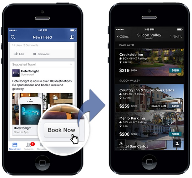
Creating effective call to action buttons that grab attention and entice clicks. These are the best practices for effective buttons.
- Banner includes logo and CTA. It is recommended for the banner to have a brand logo on the left and CTA on the right.
- CTA should be short and direct.
- Action should be clear. Users should know what to expect.
- Placement and size of Buttons should be prominent to show importance over other elements.
- Button colors should contrast from background elements to stand out.
- Don’t have too many buttons! Keep it simple. It is recommended to only have 2 actionable buttons per page and click-throughs to external content on final page.
- It’s better to guide user through the ad experience than give them too many choices and lose them.
- Make sure social media icons are button-like. Using icons alone is not efficient enough as users may not think they are tappable.

